Shopify Insights
Sliders And Carousels On Your Shopify Website: The Best And The Worst Uses
Sliders are a divisive topic in the world of web design. On the one hand, it’s been proven that people develop banner blindness and tend to ignore sliders that look like banner ads. On the other hand, the smart use of sliders can do so much for you and your business; you just need to be creative about it. In this blog post, we’ll show some of the best uses of slideshow functionality on a Shopify-based website. We’ll also share how sliders can hurt your business if used incorrectly.
The advantages of a good slideshow
Don’t forget - a slideshow doesn’t have to be just a large section that takes up most of the screen and the images and text within it change. You can show smaller, multiple slides and even show a few at the same time to highlight variety.
1. It is a visual medium
Unlike a wall of text, a slider can show your products and how they are used, without taking too much space and adding the need for more scrolling. It can highlight your sales, best selling products and their features, place focus on key ingredients and their benefits, or offer similar products all within one elegant content block. A well-placed slider grabs attention and shines a light on what needs to be seen.
2. It enhances SEO
A well-designed banner contains titles and keyword-rich text that can help get your webpage some organic traffic from search engines. A modern slider displays as well on mobile devices as on larger screens and retains all of the functionality..
3. It is versatile
A great slideshow can inspire, inform, and lead you to the content you want to see as a consumer. It can be used across multiple pages and can unite multiple forms of content, such as text, images, links, and video.
4. It gives home to your CTAs
A great slideshow doesn’t just inform; it prompts your visitors to take action. They can even house several buttons and CTAs, but they need to be styled a certain way to remain effective.
And since not all sliders work the same way, here are some of the reasons why web developers have been campaigning against slideshows that usually appear as a ‘hero section’ (at the top of the page) and fill up that entire area with large images :
- Their effectiveness declines rapidly with each new slide. People usually don’t view more than the first slide that appears
- They can be an accessibility nightmare, to the extent of becoming a legal liability for your business.
- Automated sliders often lack navigation, which leads to frustration and confusion.
- They can look like an outdated design choice if the slider is used solely as a homepage banner.
So what are the best ways to use a slider on a Shopify website?
Most themes offer a homepage slideshow that comes free with a theme, but that default tool doesn’t have much versatility.
That’s why qwiqode developed slideshow and carousel content blocks. They are responsive, customizable, SEO-friendly, and can contain one or more CTAs depending on your needs. Moreover, these content blocks can be added to various pages and areas of your website. This greatly expands their functionality from just informing your visitors of ongoing sales to highlighting your best products, and putting together themed collections and products. Furthermore, they offer a more attractive way to display various types of content, from text to static images to video.
All qwiqode carousels and slideshows have some sort of automation. But, the visitor is in full control to scroll through and, sometimes, even expand a select number of product listings or collections into a static grid view. In the back end, the animation and navigation options can be customized, for example, offering an arrow or ‘dot’ interface to choose from. The rotation speed can be sped up or slowed down depending on the amount of information required to display on each slide. Visually, the slides can be integrated seamlessly into your website with a multitude of typography and spacing/layout options tomatch the rest of your branding. And, of course, there are things like borders, margins, and button design that make this functionality even more appealing.
Looking for an easy way to add a carousel or slider to your Shopify store?
Here are several more pre-built slider templates that offer unique design solutions and can be easily added to your store

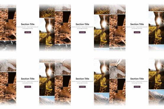
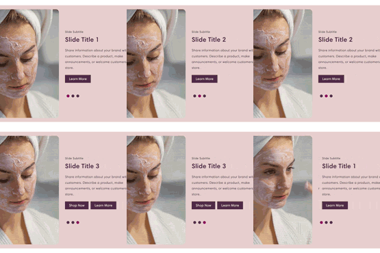
A Split Screen Hero Slider allows for a 2 or 3-column view, and can host an image, text block, or an embedded or uploaded video. You could use it at the top of the page (even just one slide) but of course, you can add it anywhere.
Shop the Split Screen Hero Slider
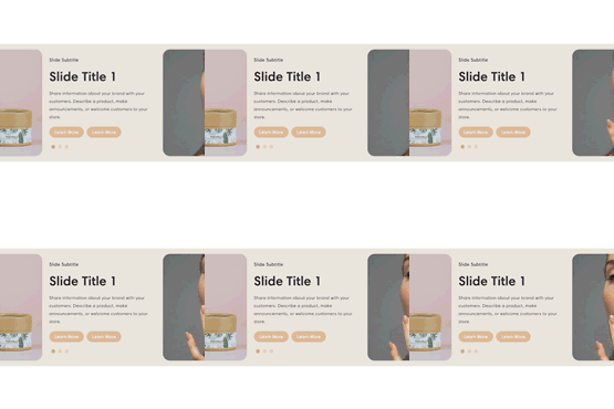
A Special Slideshow offers a modern take on a traditional slider format. It can be customized with multipleslides, a text or an image format, and static or changing imagery.
Shop the Special Slideshow
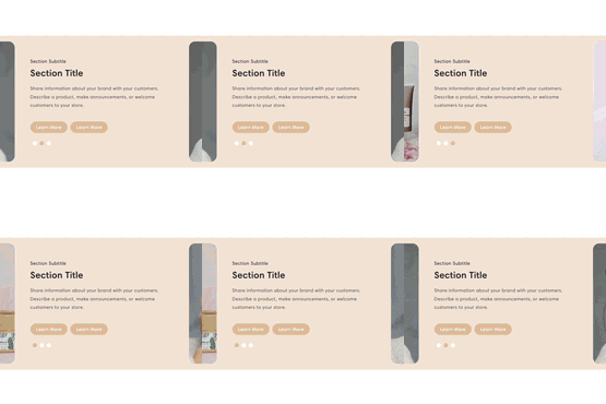
A testimonials carousel is great for displaying testimonials in a new and upbeat way. Your customers won’t have to scroll down a long list of reviews to get an idea of the kind of work that you do. Instead, they will be able to scan the reviews while the slides change. Of course, the slideshow can be paused, and any slide can be accessed via arrows or dots for detailed reading. There are testimonial carousels that are included in Shopify themes, but none have the amount of flexibility that qwiqode sections offer.
Shop the testimonials carousel
An alternative carousel provides a different way to display up to 16 items within an automated slider. A title and a call to action button can be added to each slide. It’s best used to list the benefits, showcase your image-based testimonials, or display any other information that doesn’t require a spacious text field for each slide. A separate CTA and a label can still be added to each slide if needed.
Shop the alternative carousel
A carousel of details builds on top of a “regular” slider design, but with an option to click on any of the slides to reveal more information about it. Each ‘expanded slide’ displays a larger image and a large text block and optional CTA button, all directly below the main slider.
Shop the carousel of details
As the name suggests, a Versatile Carousel has versatile applications. You may be thinking that you’ve seen this already, or that your theme includes it, but we’re sure there are various limitations that you’ve run into. With this section template, you can choose to link your collections, individual listings, blog posts, pages, or anything else you can think of. You can mix the types of links or keep them all similar. You can further customize it with options like infinite scroll, call to action buttons, and customizable images and dimensions.
Shop the Versatile CarouselUse sliders in smarter, better ways
All qwiqode sections are one-time purchase content blocks that can be used anywhere on your Shopify website. They can be reused on multiple pages, styled to fit your website and business needs, and customized to display your content in a truly flexible way. They don’t require any coding knowledge or experience. If you have any questions about our product, please check out Frequently Asked Questions. And if you need help with a custom project on your Shopify-based website, we’ll be happy to help!
