Easily install pre-built Shopify section templates without hiring a developer!
Shopify Insights
8 Mistakes to Avoid With Your Shopify Store


Online commerce competition is rapidly increasing. Shopify, a popular eCommerce platform, is home to over 1.7 mil businesses worldwide, and new websites are being created daily.
Opening a storefront is only the first step of building a successful online business. With so much competition out there, business owners have to make sure that their websites are able to attract visitors and convert them into customers.
There are a lot of design elements that can help achieve these goals. Making mistakes in setting them up, however, will come at a high cost of lost customers and loss of potential revenue.
Here are eight common mistakes to avoid in your Shopify website design if you want your business to succeed.
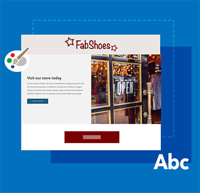
Uninspired “About” page
According to the Adobe Digital Trends report, “empathy is the future of customer experience.” Previously, it was enough to market products to its target audience. Nowadays, consumers want to know more about companies they are buying from and relate to their message.
This is why a well-designed About page should reflect what the company is like and what it stands for.
Brand messaging should be consistent throughout all website content, and your about page should highlight the company values and causes it chooses to participate in. Disclosing the “why” behind your brand is a powerful tool to utilize when talking about your company.
Many new business owners miss the mark either because they're unsure what to say or because they’re unwilling to get personal. However, adding vulnerability to your brand can increase trust and encourage visitors to make their first purchase.
Here are a few effective tips for your About page:
- Share your brand’s origin story. Connect with your visitors in a meaningful way by sharing who you are and how your brand came to be.
- Format your copy for easy scanning. Don’t make your customers dig for the golden nuggets in your content; people simply won’t read a wall of text online. Instead, if you want your message heard, make sure that the most important points are highlighted with the help of various design elements.
- Use mixed media in your content-creation process. For example, add high-quality images and video for higher engagement.
Unfriendly checkout process
The checkout process should be as simple and intuitive as it can possibly be. Unfortunately, 23% of people abandon their cart during checkout because it isn’t user-friendly.
Here are a few red flags that tend to lead to a higher abandonment rate:
- hidden fees
- having to create an account to purchase. Sometimes though, this is necessary - as in our site so that you’ll be able to access your downloads. So in this case, you should try to convey this necessity by explaining the requirement.
- requiring to submit too much personal information (e.g., phone number)
- high shipping costs
An easy solution to these problems is being transparent about shipping and other miscellaneous fees that apply upon purchase. Consider adding a clear call to action that will make the checkout process easier (e.g., “Buy Now” button) and offering a guest checkout option. You can also offer free shipping for a minimum amount which can also increase your sales.
Outdated design
Trends in website design constantly change and get updated. For example, automated image sliders were much more common just a few years back. Nowadays, minimalist design tends to convert better. Stuff your pages with too many fonts, colors, and flashing images, and 38% of people will leave due to an unattractive design.
That’s a staggering statistic considering that 98% of people won’t purchase anything on their first website visit. So don’t let outdated and clunky design elements ruin the first impression. Instead, aim to have a clean and simple layout that shows off your products.
And if you need to find a new, elegant way to display your content, consider customizable Shopify sections.
Lack of branding
You can increase your revenue by 23% by having consistent branding on your website, social media, and other platforms.
Inconsistent branding sends mixed messages to your visitors. Not having a clear vision and communicating it poorly can result in lost trust and fewer sales.
Create consistency in your branding by curating and sharing your message across all channels. Communicate with intention, and make sure that your marketing is in tune with what your company is about. When in doubt, a brand style guide can help you find consistency.
Insufficient product presentation
Product pages are essential to the process of generating sales. Optimize your product page with high-quality photography and compelling descriptions.
If your products are presented poorly, you are likely losing sales and potential customers on a daily basis.
Consider creating a story around your products with themed and lightly styled images and solution-oriented product descriptions. It helps when people can imagine using your products in their life, so make sure that your customers feel seen and have their needs addressed.
Absence of SEO optimization
SEO, or Search Engine Optimization, helps you rank higher in search engines and brings organic traffic to your site.
If you ignore it, you miss out on a major free traffic source. Here are several things you can do to get more visitors from search engines:
- Fix broken links and 404 errors
- Optimize your page load speed
- Research and add relevant keywords to the content on your website
For more details, click to read some SEO guidelines.
Lack of mobile optimization
Shopify stores are typically optimized for mobile use. However, if you have too mny elements on the page and a lot of required scrolling needed to get to your relevant content, visitors may get discouraged and lost. Also, using too many apps and outdated design elements can slow your website down, resulting in a higher bounce rate and lower search engine rankings.
If you’re not sure how well your website works on mobile, run a mobile-friendly website test and try navigating it on your cell phone.
Lack of social proof
Social proof is a great tool used for adding a sense of trustworthiness to your website. You can use reviews, testimonials, and other user-generated content such as photos and videos to show that your products are popular and worth their price.
There are a number of ways to utilize social proof on your website. Here are a few examples of what works well for many merchants:
- Highlight your best sellers with a "Popular Product" tag and make sure that people see them first
- Add a social media feed with images and videos of your product being used
- Create blog posts featuring your products (e.g., gift guides and relatable stories from staff and customers)
These eight tips will help you catch your visitors’ attention and make them stick around for longer. And if your website is designed well, you will convert them into customers and encourage repeat business.
And if you’re looking for a simple yet effective solution for your store’s content, consider custom content blocks. Make your Shopify website stand out and deliver your message with style.