Easily install pre-built Shopify section templates without hiring a developer!
Shopify Insights
5 Homepage Design Tips To Increase Sales


The homepage is the face of your website. Just like a business card explains what your company does, a homepage explains the nature of your business. Studies find that almost every visitor lands on your homepage at some point.
So while it’s tempting to add as much information as possible to your homepage and give your visitors a glimpse into everything your business does, it’s almost too easy to overwhelm people with this approach. Besides, times have changed, and homepages cluttered with auto-changing slides, multiple offers, and a myriad of products are no longer considered to be the industry standard.
So let’s talk about what kind of homepage design works and how to create a welcoming homepage that converts your visitors into customers.
1. Decide on the primary goal of your homepage
Businesses have different goals at different stages of their growth and development. For example, an established, well-recognized brand and a new company just trying to gain recognition will display their content differently. Furthermore, they will have different CTAs since their goals vary quite a bit.
So consider the objectives you’re trying to accomplish on your homepage. Would you like to collect more information about your visitors? Do you want to direct their attention to the newest product line? Are you trying to solve an existing website problem, for example, a high bounce rate? You will need to design your page with that goal in mind.
2. Make your CTA stand out
Whatever your objective may be, your call to action is a way to enforce it. Usually, a CTA (“Call to Action”) is represented by a boldly colored button that prompts visitors to do something.
There isn’t a magic number to describe the perfect number of CTAs needed on a homepage. Sometimes, one is just enough. Occasionally, it makes sense to have multiple CTAs. However, it’s easy to overwhelm visitors with too much choice, so a smaller number can often be a wiser option.
The location of your CTA matters too. It should be placed above the fold and easily visible as soon as the page loads through.
You are splitting your visitors’ attention with every new block and section on a page. If you have just one or two buttons, it’s easy to notice them. But if you add a couple more brightly colored objects, sprinkle in overly creative typography, or if your main image outshines the button, your CTA might get overlooked. That, in turn, will destroy the conversion rate of your homepage and the whole website.
3. Have your homepage copy support your main goal
Adding a bright color to the button is not the only way to make it pop on your page. Writing copy that supports the action that you want your visitors to take is another great option. Persuade users to click the button by explaining what they will gain in return for their effort. You can add a tagline around the button, have a few lines located within the image surrounding the button, or get creative with Shopify sections.
For example, you can add some text with the help of qwiqode Special Slideshow content block. While automated image sliders aren’t always a great solution, a slider that changes its default image and text only upon a customer’s action can be a helpful tool on the homepage. Split-screen Hero could be another elegant way to display multiple CTAs without adding clutter.
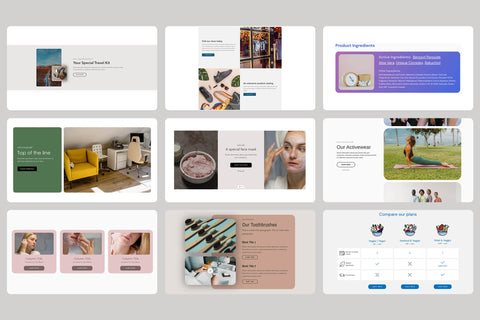
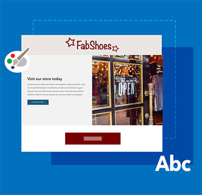
4. Don’t just tell; show
Images are an excellent tool for any website. A well-styled photo can substitute a whole block of text, show off your product, and make your audience feel seen by featuring a customer’s persona. It will deliver your message, visualize your value proposition, and provide context to your offer. The only catch is that it has to tick off multiple boxes to be truly effective.
These days it is widely common to use a hero image, which is a full-width image located right at the top of the homepage. Companies use four kinds of hero images: product images, contextual hero shots, founder images, and non-contextual shots.
Regardless of the type of hero image you choose to go with, it should fit some of the following criteria:
- Keyword relevance. Do keywords used to reach your website through search engines align with what the hero image is referencing?
- Purpose clarity. Do depicted scenes and featured items align with your business and your message?
- Design support. Does it visually support the CTA located next to it? Does CTA still stand out enough to remain actionable?
- Authenticity. Does it credibly represent your brand while also setting realistic expectations?
- Added value. Does the hero image enhance your message, answer customers’ questions, or differentiate you from your competitors?
- Desired emotion. Does the shot evoke a feeling that you want to be associated with your brand?
- The Hero. If your image shows people, do they represent your customers? How are they utilizing your product in that shot?
5. Keep the homepage short and sweet
We have established that above the fold area should be concise and focused on the main CTA(s), but what about the rest of the page?
Studies show that “4 out of 5 visitors only see the first 3 screenfuls of your homepage.” That trend limits the length of the homepage since people stop paying attention after the first several scrolls.
Adding content to the limited amount of available homepage real estate comes down to your business goals and company branding choices. For some websites, heavy use of portfolio-like imagery may make the most sense. For others, sections with the copy (ex., About content blocks, or written out benefits of using the company products) may be a better option. In most cases, a mix of both may be a prudent choice. Here are several more ideas of what types of content will add value to your homepage:
- Reviews and testimonials that enhance the trustworthiness of your website
- A comparison table that shows features of your products or positions you against other popular products on the market
- An interactive CTA such as a prompt to take a quiz that will find personalized products for you on the website
A homepage is there to represent your website and business as a whole. It’s the page that gets a lot of play, so it’s significant enough to have its design examined regularly and changed as the business changes too.
If you need help redesigning your site with Shopify 2.0, consider teaming up with an experienced developer to get the best results.