Easily install pre-built Shopify section templates without hiring a developer!
Shopify Insights
10 Actionable Ways To Optimize Your Shopify Product Page


Arguably, designing a product page will be one of the most important decisions about your website. Converting visitors into customers is not easy, but now that product pages can be easily customized with Shopify 2.0, you have all the tools necessary to make your products stand out.
It is well-known that attention is in short supply these days; the average consumer attention span is only 8 seconds. Given that, the first impression may very likely become the last impression, and a merchant’s job is to present their brand and products in the best light possible. A good product page captures visitors’ attention, prompts them to click your CTA (call-to-action) buttons, and converts them into customers.
Here are ten ways to do that on your Shopify website.
1. Design a minimal, uncluttered layout
Every page has its primary goal. For example, a product page exists to effectively showcase a product and encourage visitors to buy it. The page layout should support that goal by displaying content that will get the job done without getting visitors distracted or sidetracked.
The most necessary elements include product images, a written description, and a button letting visitors add the product to the cart or allowing them to check out immediately. It’s typical to have a busier layout if the product has variations or requires additional information to be displayed. However, less is more, and a minimalist approach to designing a product page often pays off.
2. Be intentional about the content above the fold
“Above the fold” content refers to what a visitor sees on a page before scrolling down. The content needs to hook visitors and be interesting enough to make them want to learn more about your product and business.
The information above the fold of a listing page should be sufficient enough to explain what your product does and what it looks like. That is achieved with the help of an accurate title, several detailed product images, and a couple of short but impactful sentences describing the product. A CTA button should also be readily available without making a user scroll to reach it.
Some products require a lengthy description; sometimes, other elements such as a short FAQ or care section may be necessary in order to present your item properly. However, that info can be pushed below the fold as long as the top part is adequately descriptive.
Another thing to consider is various screen sizes. The same information will load differently on a laptop and on a smartphone. That’s why many developers like to keep above the fold layout minimalist. This way, everyone will get more or less the same information regardless of the device they’re using to access the website.
3. Choose the button style wisely
The Add To Cart button should be at the center of your page. It should be easily noticeable and stand out from the rest of the content. That can be achieved with bold colors of the button or its outline, and a creative copy choice that replaces the generic “Add To Cart” phrase.
Lately, the Buy Now button has become a mainstream addition to the product page design. Studies show that it can be very effective, especially for returning customers or those shoppers who buy only one product at a time.
4. Make variations of the product easy to pick
If a product has variants, it’s wise to add that information above the fold. That is especially true if the variant choice affects the price. Shopify allows attaching specific photos to the variants of the listing so that the main photo changes when you pick a new option.
Setting up a listing this way may be more time-consuming, but you’ll be more likely to avoid product exchanges that result from confusion around your product options.
And if there are simply too many variants to choose from, it may be easier to set up separate listings. This way, you won’t have to cover all possible variant intersections on one page.
5. Use optimized images and videos
Page load speed is paramount when it comes to the online browsing experience. If your images and videos take too long to load, customers will likely bounce and go to a different website that loads faster.
Choosing the number of photos should compromise the total file size and how long you want the wait to be. It also depends on what type of products you’re selling. In some industries, such as jewelry sales, you want to be able to zoom in on the picture to showcase the product in its finest detail. In other industries, zooming in may be unnecessary, so decreasing the file size would be a no-brainer. While implementing “Lazy Loading” which is a Javasript library that loads images on demand as opposed to all at once when the page loads, is a necessary solution (and usually added by your theme), using image compression software like TinyPNG can be a great solution to lower the file size of those images even more. Especially for those businesses that want to have an extensive image gallery for each listing.
Talking about the total number of images or videos, customers expect to see an average of six product images per listing.
6. Write engaging, keyword-rich product descriptions
Product descriptions are written for both humans and search engines. They should be engaging, informative, and concise yet also contain all the necessary keywords and phrases to attract more search engine traffic.
As we mentioned above, the first sentences really matter since they often appear above the fold. They should explain what the product does and describe its main features. Some businesses like to use bullet points to highlight the characteristics and make the description easy to scan; others utilize storytelling to help customers imagine how they will use the product. As long as you present the most relevant information at the top of the description, the rest depends on your product lineup and branding choices.
7. Split your description into sections
If the description gets too long or complex, consider splitting it into several sections. This way, visitors will be able to scan it at a glance and choose the parts to read that are important to them.
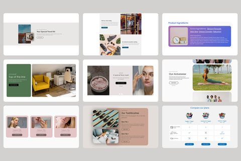
Additionally, you can hide some of the text into a content block such as Info Accordion. It is a collapsible block that hides most of the information while showing each section's title. It makes your product page look more organized and put together. Plus, you can easily choose colors and fonts and change margin size to match the rest of the page design.
8. Avoid links that can distract your visitors
This is another tricky thing that should be carefully balanced when designing your product pages. On the one hand, you don’t want to overwhelm your visitors with too much info and a multitude of buttons to click. But, on the other hand, you don’t want to send your potential clients away from the page with an Add To Cart button to a different page just to share somewhat relevant information.
That’s why adding links to pages such as Frequently Asked Questions, Shipping Info, or Return Policy may not be the right choice for your product page - or at least adding it further down on the page. Instead, consider adding a short and sweet product-specific section at the bottom of the description. It can answer potential questions and explain your store policies without sending website visitors on an informational detour all over your website.
9. Upsell and cross-sell your products
Upselling and cross-selling your products is a wonderful way to increase your average ticket and make additional revenue for your business. Adding related items to your listing can be done in several ways:
- pair your product with matching goods in a “lifestyle” photo,
- offer product bundles,
- utilize apps to add a block with related items below your listing
- get creative with qwiqode content blocks and add a section like Carousel of Details to a listing to highlight a line of products without leaving the page
10. Provide social proof
Social proof such as reviews and testimonials is integral to building a sense of trust with your visitors. But, again, there are multiple ways to facilitate that. Some options include subscription-based apps that display ratings for individual products or a one-time-purchase of a content block that shows customer testimonials about your business as a whole.